New Moralities - Opera performance
Scenography and costume design
Opera Forward Festival 2022
OFF Lab - Visual Arts
"New moralities" play
Whereas in the Middle Ages public space was used to reflect on human virtues and vices through theater and performance, this play is looking for a contemporary relationship between art and morality. The artists have a visual method as a common denominator, but come from different disciplines: from Electronic Dance Music to performance art.
OFF Lab - Visual arts is a collaboration between the University of Amsterdam (MA International Dramaturgy) and the Conservatorium van Amsterdam (Amsterdam Electronic Music Academy and Pop Music)
Artistic Coordinator OFF Labs
Sharon Minailo

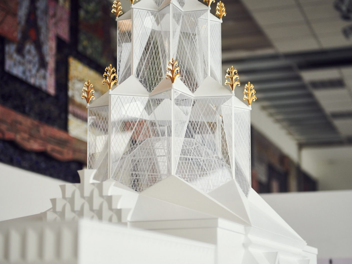
Drifting Architecture
Critical project
Drifting Architecture is study work and a series of massing models by CENTRALA (Małgorzata Kuciewicz, Simone De Iacobis), 2020–ongoing. The project is part of the Warsaw Wetscape series.
The speculative and performative aspects of Drifting Architecture stem from water buoyancy that replaces gravity as architectural principle.
Forms studies: Małgorzata Kuciewicz
3D modeling: Aleksandra Zawistowska
Model making: ONIMO
"A study of sometimes aquatic, sometime terrestrial forms is an introduction to a radical redefinition of urban infrastructure. In periods of sufficient water it would drift, but in times of drought it would settle on land. A recently deciphered cuneiform tablet described, the ark from the Babylonian flood myth as a huge, round coracle. By suspending our belief that architecture is static, CENTRALA plays with archetypes of the ark (a round boat) and of architecture, transforming familiar forms in the search for new meanings, sometimes through the very act of placing a copied architectural form in water.
In the restoration of wetlands and rewilding of urban rivers, CENTRALA sees an answer to the climate challenges of the future. In its projects it proposes a vision of a hydrated Warsaw, in which the recreated hydrological network regulates urban microclimates and opens them up to dynamic flows. Cities as wetscapes need the drifting architecture.
An inspiration: A coracle is a light, one-person boat that can be carried on the back. It is the oldest type of boat constructed by humans. The oval bottom without a keel provides even distribution of the load and good displacement."
From CENTRALA website.
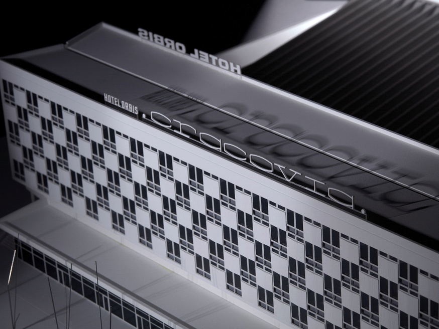
Sections. Polish Architecture of 20th and 21st century
Exhibition
Architecture is an important part of our everyday life, shaping public space, the context of a place, even influencing the environment. It became the theme of the permanent exhibition ‘Sections. Gallery of Polish architecture of the 20th and 21st centuries’.
The gallery is devoted to the history and contemporary times of Polish architecture. The ‘Sections’ nature of the presentation, to which the exhibition title refers, relates both to historical or formal transformations, as well as to the functional diversity of the presented objects, allowing to see the importance of architecture in designing various areas of everyday life.
The exhibition is divided into six sections corresponding to six themes. They are: Composition, Nature, Technology, Manifesto, Time and Space and Cost. These concepts are meant to act as signposts for the public in their wanderings through the history of Polish architecture, as well as to broaden the area of reflection to include the perspective of trans-regional and timeless questions. Among the problems discussed at the exhibition will be such issues as: housing, common spaces, social responsibility of architecture or new urban solutions, i.e. still current issues for architectural activity, with significant consequences for our everyday life. Apart from models presenting selected realisations, the exhibition will also include projects, photographs and multimedia materials.
The Gallery, located on the second floor of a nineteenth-century bourgeois tenement house, is a prelude to the future activities of the new branch of the National Museum in Krakow, located in the former Cracovia Hotel.
Curators: Weronika Grzesiak, Małgorzata Jędrzejczyk, Kacper Kępiński
arrangement design: Agnieszka Szultk Dreamandart
project coordinator: Katarzyna Pawłowska
model design: CENTRALA (Małgorzata Kuciewicz, Simone De Iacobis), Aleksandra Zawistowska, Billy Morgan, Julia Lipińska, Kamil Urban
My tasks consisted of designing architectural models, based meticulous work and in-depth analysis of archival drawings and historical photos.
- Polish pavilion for the 1925 World’s Fair in Paris, scale 1:15
- restaurant pavilion in Kraków, 1936, scale 1:50
- Warsaw’s Praga II housing estate and the zoo, 1958, scale 1:1000
- two typical three-room apartments in prefabricated mass housing: ‘M3’ from 1970s and ‘M3’ from 1980s, scale 1:50
- Palm House in Gliwice by Andrzej Musialik, 1982-98, scale 1:200
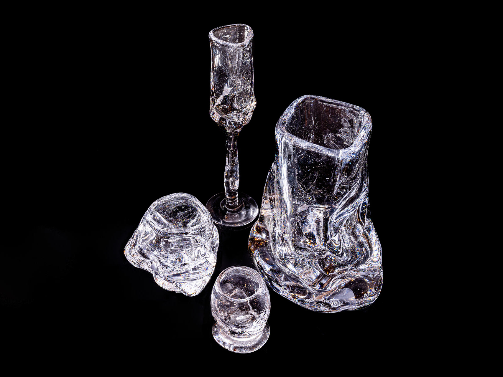
SZKŁO
SZKŁO
Szkło [Polish: glass, pronounced /shkwo/] are deconstructed functional glass sculptures.
Szkło are one of a kind glass sculptures, hand-blown and modelled in Amsterdam by Aleksandra Zawistowska and her team of skilled craftsmen. Szklo’s unique shapes are created by celebrating the organic character of glass which is highlighted in the glassblowing process, creating unique glassware.
Szkło merges years of craftsmanship with an admiration for the raw material. Szkło challenges the traditional glassblowing process, turning it into a sensorial experiment. By not relying on traditional moulds, these sculptures take coincidental, spontaneous forms - often challenging the notion of beauty.
The glassblowing process is as important as the final form of the design. The mission is to push the boundaries of functionality and materiality, turning the simple act of eating and drinking into an experience. Szkło celebrates uniqueness and diversity. Szkło is an invitation to limit our possessions and cherish the quality of individual objects.
Szkło pieces are designed for daily use as well as for special occasions. The glassware is available in a series composed of different types, including tumblers, footed and stem glasses, mugs, carafes, vases or bowls. Szkło can be incorporated as a functional part of your daily routine or simply as a decorative object for your home. Ranging from 500 grams to 8000 grams in weight, the designs focus on the various qualities of glass, such as its weight, transparency and temperature.
Szkło is a practice of slow and careful production that challenges the patterns of traditional, mass production. The process of creating Szkło begins with conceptual sketching, outlining the ambition for each piece. Once the production begins, the process is guided by an organic approach. The designs are shaped from bespoke moulds made in the workshops from available materials, such as stacked bricks, and chunks of wood or stones. Due to this organic process, the remains of these natural materials are often visible in the finished sculptures. The intention behind Szkło is to capture the process of glassblowing by visualising it for future customers.
Szkło is locally produced in the Netherlands, in the National Glass Museum in Leerdam. Szkło is a collective of three craftsmen guided by Aleksandra Zawistowska, including the main glassblower, an assistant and a cold worker. The production spans around five days.
www.szklo.studio
ig: szklo.studio
fb: szklo.studio
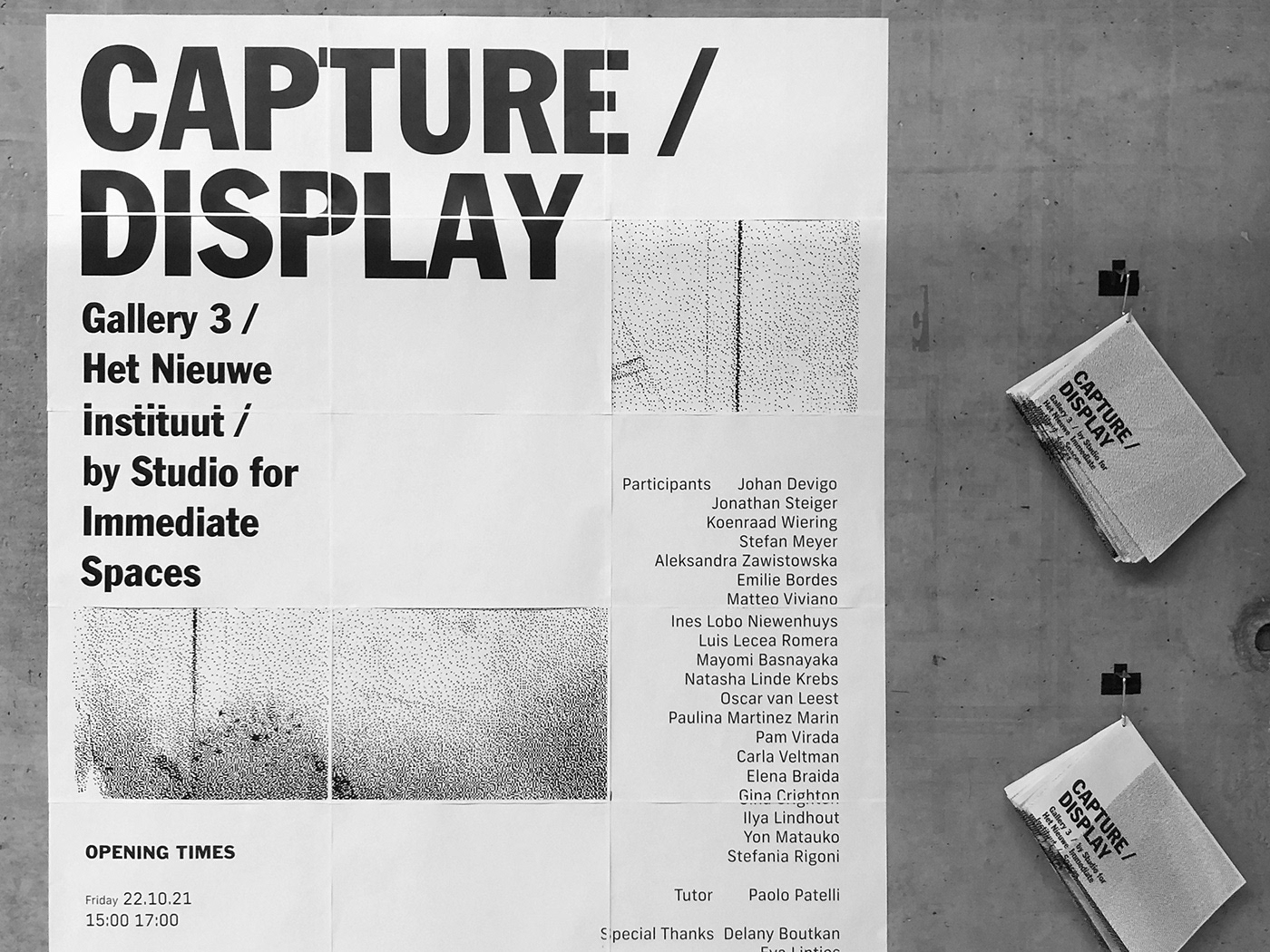
Capture/ Display
Critical project, audio-visual installation
Sandberg Instituut’s Studio for Immediate Spaces spent a week in close contact with the collection and the spaces of Het Nieuwe Instituut. Working collaboratively, the participants identified key documents from the drawings, photographs and models belonging to the archives of Dutch architects and urban planners. They considered how things appear, how they are stored, who collected them and why they were kept and deposited. Finally, they mobilized the documents, giving thought and shape to what they wanted the documents to do differently. The result is an exhibition as a critical documentary, exposing modes of operating on the documents: copying, enlarging, folding, displacing, recontextualizing, deleting, editing, reclassifying, translating, hiding.
Within self-imposed constraints, the production was kept to a bare minimum: two walls, one printer, one sound system, one tape roll. Four groups storyboarded strategies for a potentially cinematic space, articulated in four chapters, each linking back to a set of documents from the institute’s collection.
Using the archive is not a neutral but a creative act with an aesthetic intention, an audience and a purpose. The exhibition is the means to select, present and create new adjacencies, allowing for new types of knowledge circulation.
Impossible interview with the Sonnevelds
Audio-visual installation
in collaboration with Emilie Bordes and Matteo Viviano.
In this installation, the main figures of the Sonneveld family, Gesine and Albertus, are imagined sharing anecdotes about each other in relation to two objects chosen from the archive of Hew Nieuwe Instituut, Rotterdam (NL).These impossible interviews question the limits of the cataloging strictly divided ownership of two objects that for decades have shared the same living environment.
Sound system by SIS 2017
Workshop led by Paolo Patelli
Participants: Pam Virada, Emilie Bordes, Jon González De Matauko, Johan Devigo, Natasha Linde Krebs, Luis Lecea, Ella Mathys, Stefan Meyer, Stefania Rigoni, Matteo Viviano, Aleksandra Zawistowska, Mayomi Basnayaka, Marcelo Javier Acevedo Pardo, Elena Braida, Jonathan Steiger, Ilya Lindhout, Gina Crighton, Oscar van Leest, Paulina Martínez Marín, Koenraad Wiering, Carla Veltman, Ines Lobo Nieuwenhuys.
Roots and Wings
Exhibition
Graduation Show Exhibition of Design Department and Studio for Immediate Spaces of Sandberg Instituut at Het HEM, Amsterdam on 8-10th of October 2021.
Navigating in a hazy cosmos of blurry frontiers, how can we perceive any form of reality and where can we place ourselves within it? A question that the students of the Design Department and the Studio for Immediate Spaces investigated in many ways, in between concise taxonomies of fragments of culture and speculated scenarios of potential futures.
They now present «Roots and Wings», an exhibition extracting yesterday’s essence and cultivating tomorrow’s possibilities, enquiring on our possible and impossible destinies.
In between this multitude of past and future individual journeys, the exhibition unveils itself as a liminal space, an intersection where different origins and bearings meet without the boundaries of time, geography, perspective or dimensions.
The presented works are a result of these direct and indirect encounters. From their intertwining, four distinct interpretive characters emerge. The Observers who analyse uses and perception around our current domestic environment as a way to seek their alternatives. The Orators who, by delving into foundations of past uses and rituals, create new means of transmission of knowledge. The Pathfinders who reshape current phenomenons with the ghost of their past as a way to craft their future identity. The Insurgents, who alter perceptions of historical and cultural events, giving them a new possible reality.
«Roots and Wings» allows the visitor to experience and engage with alternative readings of different times and places of human history, increasing our general understanding of our resonance into our past and future.
Curation and design team:
Emilie Bordes, Lukas Engelhardt, Stefania Rigoni, Sheona Turnbull, Matteo Viviano, Katharina Wittling, Aleksandra Zawistowska
Artists: Anna Bierler, Daphne Keraudren, Diego Virgen, Eleni Papadimitriou, George Mazari, ghenwa abou fayad, Hannah Rose Whittle, Jun Zhang, Maria van der Togt, Mariel Williams, Niveau Zero Atelier, Pernilla Manjula Philip, Stelios Markou Ilchuk, Toni Brell, Valentine Hhevah Langeard, Various People, Zane Zeivate, Zgjim Elshani
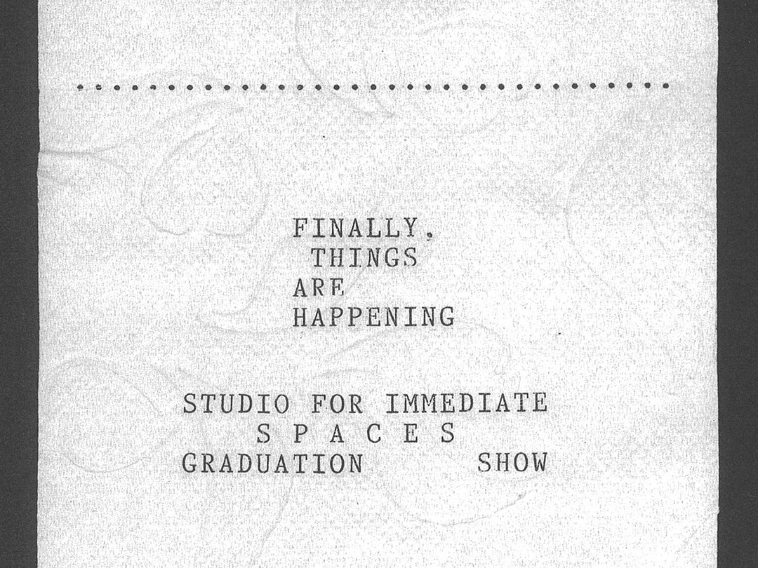
FINALLY, THINGS ARE HAPPENING.
Visual identity
"FINALLY, THINGS ARE HAPPENING" was the Graduation Show 2021 of Studio for Immediate Spaces, Sandberg Instituut. The exhibition took place in June 2021 at Maison Descartes in Amsterdam.
Curator: Kristoffer Zeiner
Artists: Daphne Keraudren, Valentine Hhevah Landeard, George Mazari, Eleni Papadimitriou, perf. Group, Maria van der Togt, Diego Virgen, Mathias Vincent-Palazzi, Hannah Rose Whittle, Mariel Williams, Zane Zeivate, Jun Zhang
Visual identity in collaboration with Yon Matauko and Stefania Rigoni

Marking the Site
Artist residency
"Marking the Site" was the artist residency program in "When Site Lost the Plot" Art Gallery, Amsterdam (NL).
7 days, 7 artists, 24 hours each
Each temporary-resident reader had the opportunity to stay for a night and react in thier own way to a curated domestic environment, containing in itself items, research and literature that the Second Thoughts reading group finds significant to the discourse of non-Western European narratives.
Artists: Lema Aloul, Alina Lupu, Yon Matauko, Stefan Meyer, Mariana Jurado Rico, Stafania Rigoni, Diego Virgen
Curators: Eva Mahhov, Aleksandra Zawistowska

POLY-CULE
Critical project, site-specific installation, performance
What if we abandon mono-normative models and poly-normalise all kinds of kinships and family structures? How could we live together if we abolish layouts created centuries ago? How could opening the social norms influence our design? What is our approach to “we” and how to translate it into a built environment?
Polyamory as an alternative for monogamy, questions social structures and behavioural rules. This project, translated into a speculative brand concept opens a discussion about the relation between mono-normativity and space in its physical, political, economical and social aspects. The startup POLY-CULE blurs the lines between notions of caring and the capitalisation of relations and emotions.
Brand concept based on "This is my partner and this is my other partner" research and paper conducted during the first year of Studio for Immediate Spaces Master Course at Sandberg Instituut, Amsterdam (NL). Project was a part of “Meanwhile”, Studio for Immediate Spaces first-year final show at Overchiestraat 188, Amsterdam.
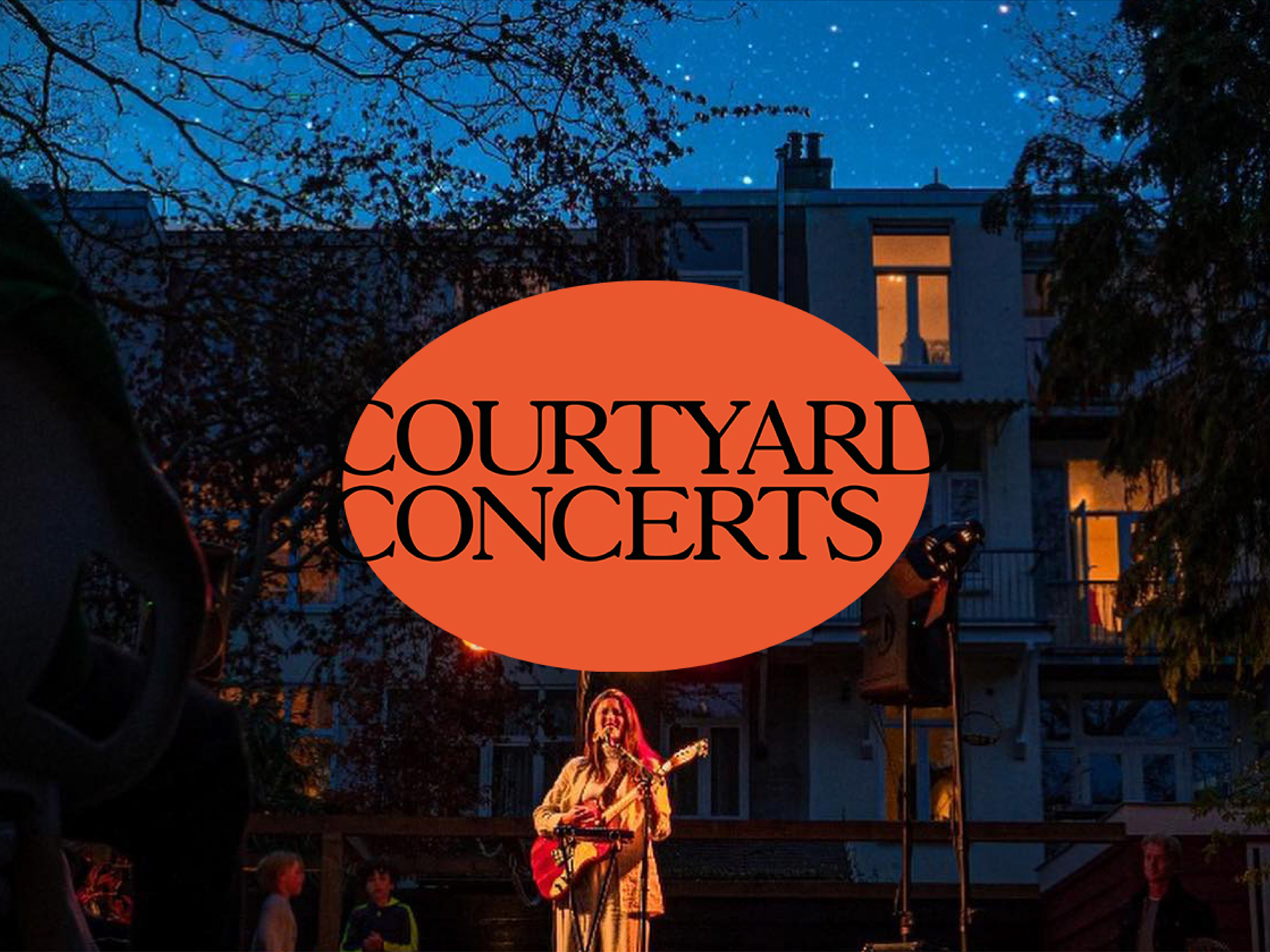
Courtyard Concerts Amsterdam
Visual identity
Courtyard concerts is an initiative of a group of talented musicians and organisers who travel around the city to host concerts at the places that Covid measurements allow.
Where we can play, we will play!
Think of courtyards, balconies, terraces and gardens. Not waiting for the changes that lay out of our hands but making use of the opportunities that are still present.
In collaboration with Yon Matauko.
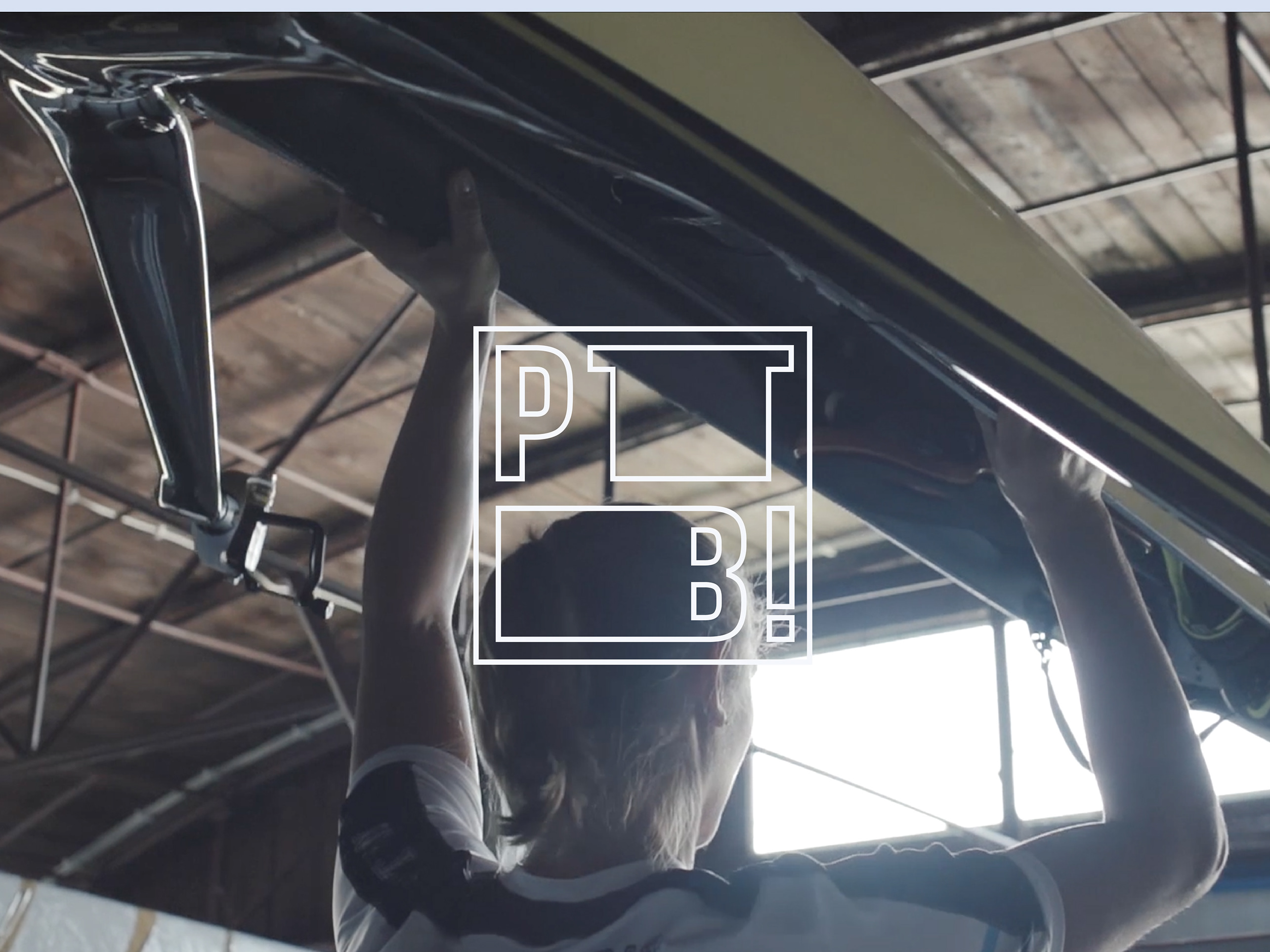
PRIME TIME BABE!
Visual identity
Branding of PRIME TIME BABE! Media House located in Warsaw. The visual identity, using a kinetic typography, is tailored to the needs of being displayed on various screens, as the company main focus is digital creation.
Les Espaces de Jeux
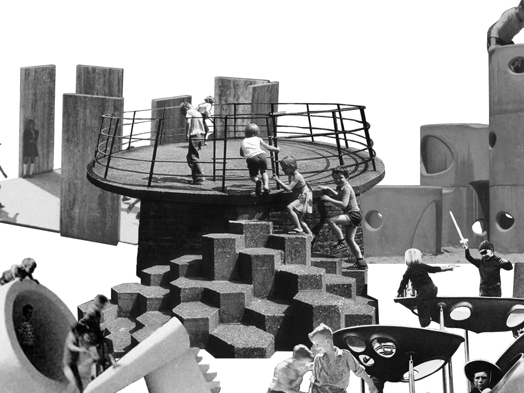
Visual essay
The article including collages of historical photographs treats about the phenomenon of playgrounds. The essay was published in RZUT Kwartalnik Architektoniczny +25: ZABAWA (3) 2020.
Intro: "It seems that what distinguishes today's playgrounds from those of the previous century is the belief in the power of children's imagination. The idea itself is a response to the legal restriction of the work of minors in the 19th century and the emergence of the "problem of free time". Playgrounds, their forms and materials used, changed throughout the previous century. They were treated as inseparable parts of the urban planning of a larger scale, cityscape, landscape or housing estates. Artists, sculptors, painters and architects were responsible for their projects, so they were often elements of functional art. "
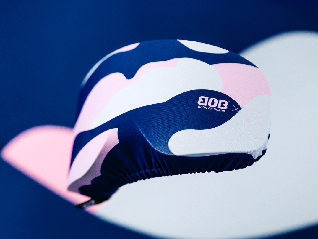
BOB Goggles Cover Sock
Textile pattern design
Design of Goggle cover socks for Born On Board.

Dostroyka - Tbilisi Architectural Biennial 2020
Digital project
What is common space and who creates it? What spatial impact do individual actions have on shared space? Can aesthetic chaos be overcome with better personal choices?
The idea of commons may seem fundamental to Georgian culture, wherein family and social life play a central role. However, while the sense of collectivity is present in everyday life, notably in the form of various get-togethers and mutual care, the attitude to the common space doesn’t seem to be embodying this togetherness. Perhaps in the aftermath of the Soviet reality, the concept of public space – and the collective responsibility for it – remains quite abstract. Common space is often defined by a spatial chaos, largely produced by thousands of what we call dostroyka’s.
The project was developed in the framework of Tbilisi Architecture Biennial 2020. The second edition of the Tbilisi Architecture Biennial, which is conceived under the name What Do We Have in Common proposes to take a closer look at the notion of commonness in our increasingly individualized and fragmented societies. Due to COVID-19 Tbilisi Architecture Biennial 2020 is carried out predominantly online.
The project takes the form of an interactive platform, wherein the “visitors” of the Biennial get to construct a piece of a virtual building with the use of a photographic archive of existing Tbilisian facades. The result is an ever-changing “block” with a patchwork of dostroyka’s. The digital model is ready to be "inhabited" by the exhibition users by selecting a fragment of the facade and placing it in a chosen place on the facade of the building. The 3D model updates in real time according to the decisions of subsequent visitors, resulting in a constantly changing elevation.
Complementary part of the project is a publication with the same title, including an essay of Stasia Budzisz and her interviews with Marika Pirvelli, PhD in Earth Science, lecturer at the Chair of Social Geography and Spatial Planning, specializing in the semantics of urban space and Aleksandra Czyżewska, an urbanist and expert on revitalization and development working as an adviser on cities and regions development in Georgia.
The project was presented during the duration of Biennale 17.10- 08.11.2020 in Kiyv, Dnipro and Ivano-Frankivsk as a part of the exhibitions organized and curated by research center MetaLab.
Curatorial and design team: Aleksandra Zawistowska, Anna Nauwaldt, Stasia Budzisz
Full-stack web development: Krzysztof Nazar, Agnieszka Wardzińska
Photography: Dina Oganova

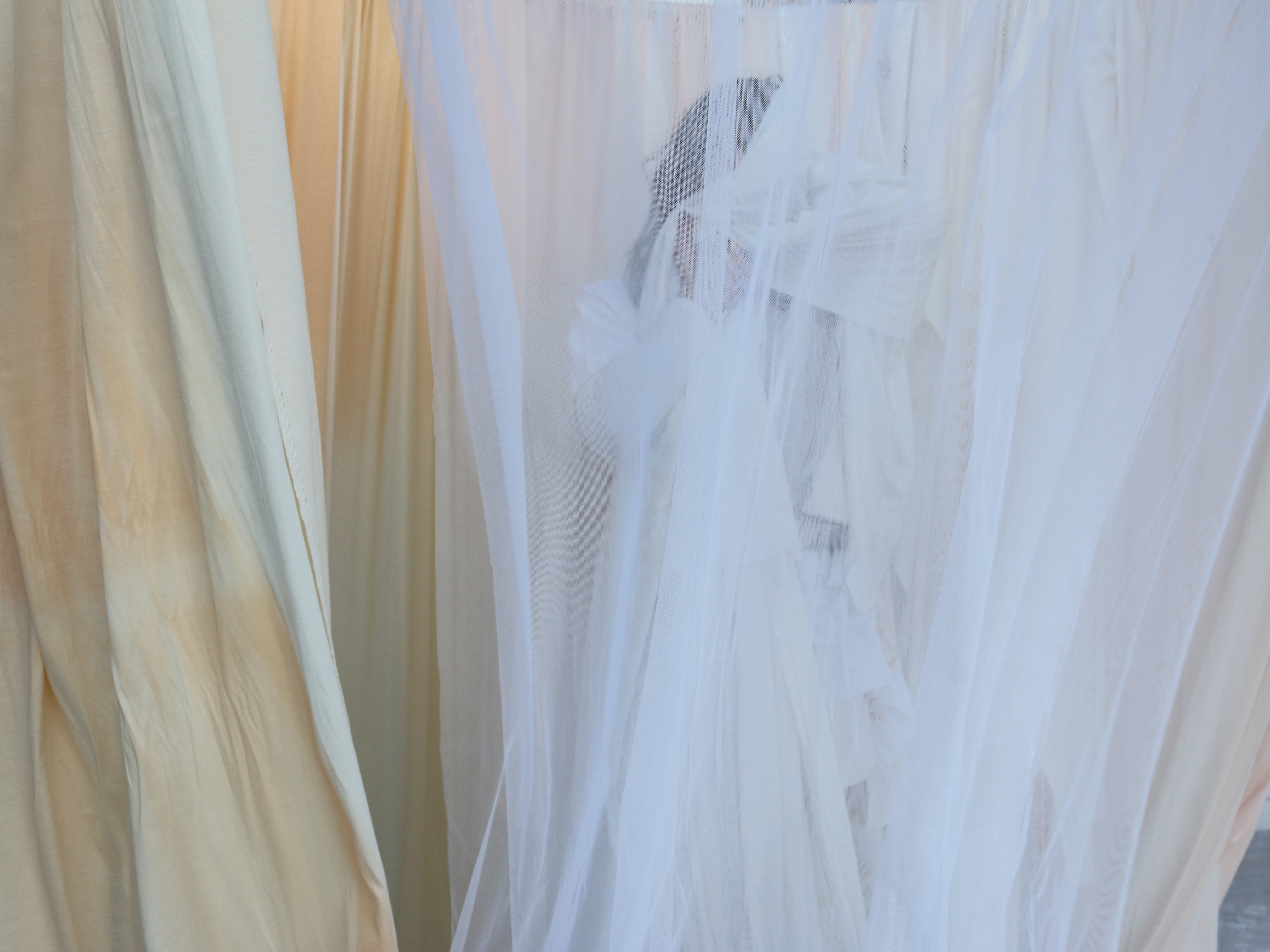
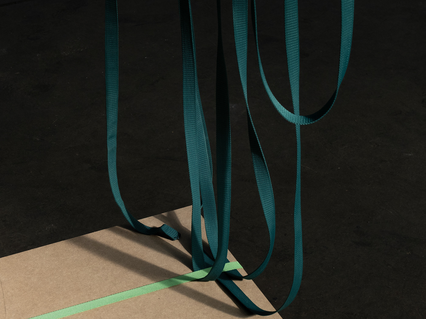
Vibrant Stage - Critical Studies Graduation Show 2020
Scenography
Project for Graduation Show 2020 of Critical Studies, Sandberg Institute at Het HEM, Amsterdam (NL).
The Heretofore stage domesticates and inhabits the exhibition space’s skeletal structure through the ritualistic act of ‘laundry hanging’. Through the materiality of the fabric, the apparitions envelop the space with intimacy and care, while being an ephemeral structure that allows for hybridity and transformation. In one way, by manifesting ‘the laundry’ and the proximate accumulation of fabrics, the deed becomes an analogy to vulnerability. The release of the guard through the malleableness and the allegorical significance of the material draws a line to the state of intimacy. To reach it, the act of ‘opening-up’, and to allow oneself to become exposed or even lightly veiled, is essential to the scenography.
Design team:
Johanna Seelemann, Aleksandra Zawistowska, Emilie Bordes, Luis Lecea, Matteo Viviano, Pam Virada, Stefan Meyer, Stefania Rigioni, Yon Matauko, Natasha Krebs.
Exhibition Forms
Sculptures
Series of shelves designed for La Mania Fashion and La Mania Home Showroom.
La Mania showroom is located in the building of National Theatre in Warsaw (PL). It consists of two spaces: La Mania Fashion and La Mania Home. Both of them completely different and yet having their roots in the same characteristic of the brand's visual identity. The inspiration for the design were the brand’s recent op-art inspired collections and aesthetic - black and white geometrical shapes. The interior design mixes motives of origami by implementing complex geometry and folded walls with optical illusions. La Mania Fashion is a minimal space, from one perspective black, from the other white. La Mania Home is a space contrary to subtle Fashion - it is white box with black stripes and complex furniture with exhibition shelves having additional function - storage spaces inside.
In the central point of Home space is implemented ultramarine sculpture, exposing domestic utilities and accessories. In Fashion part, steel white self-standing sculptures and hangers, designed to exhibit clothing collection.
In collaboration with Boris Kudlicka, Rafał Otłog, Weronika Libiszowska and Aleksandra Konstanciak.
La Mania Showroom
Interior design
La Mania Atelier and La Mania Home Showroom are located in the building of the National Opera and Theatre in Warsaw.
La Mania Atelier and La Mania Home Showroom are located in the building of the National Opera and Theatre in Warsaw. The space is divided into two completely different worlds, yet rooted in the same characteristics of the brand’s visual identity. The inspiration for the design came from La Mania 2020 op-art-inspired collections exploring the aesthetics of black and white geometrical patterns, and optical illusions very characteristic for this period in arts. The interior is eniriched with custom designed and hand made metal exposition sculptures.
La Mania Atelier is a minimal space playing with strong contrasts. By imprementing folded walls covered with black and white stripes, the space from one perspective becomes completely black, whereas from the other- white.
As the biggest challenge occurred to be a limited space and the wide range of brand’s product, the core idea was to create a complex furniture allowing to display multiplicity of products and at the same time store others inside its construction. The Showroom is a total white box covered with delicate white stripes and cobalt shape in front of the entrance. Reffering again to the strong character of La Mania’s identity and their op-art collection, but in a completely different approach as La Mania Atelier.
Design in colaboration with Kudlicka with Partners (Boris Kudlicka, Weronika Libiszowska, Rafał Otłog, Aleksandra Konstanciak)
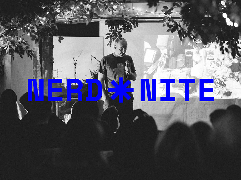
Nerd Nite Warsaw - Open Forum for Knowledge Exchange
Discussion panels
Nerd Nite is a series of events that main goal is a knowledge exchange. The non-academic approach of sharing experiences and opinions creates a democratic form open for everyone to participate. The main goal of Nerd Nite is to treat the knowledge as a goal per se rather than a mean to the goal.
A starting point to all discussions are curated subjects of lectures, however these are all participants, who shape the final effect. Lectured are not moderated and discussion's participants themselves explore topics basing on their curiosity, interests and experiences. This collective work in form of lectures with debates afterwards is opening many topics one can not face with in their daily routine and environment, gives an element of surprise and brings out of one's bubble.
The formula of each meeting consists of three or four 30 minute lectures with a time for discussion and a short break in between. Event is held once in six weeks in No Problem Bar, as it creates the atmosphere very informal and comforting for everyone to express their thoughts. The entrance is open and free for everyone, the same as giving a lecture. The spectrum of subjects discussed is wide, some of the examples are: "Japanese automotive culture", "Sleep optimisation", "Opera in contemporary popular music", "The economic aspect of a meat diet", "Privacy in the age of the Internet", "Conservation of monuments - what for do we do it?".
Visual identity design in collaboration with Anna Nauwaldt.
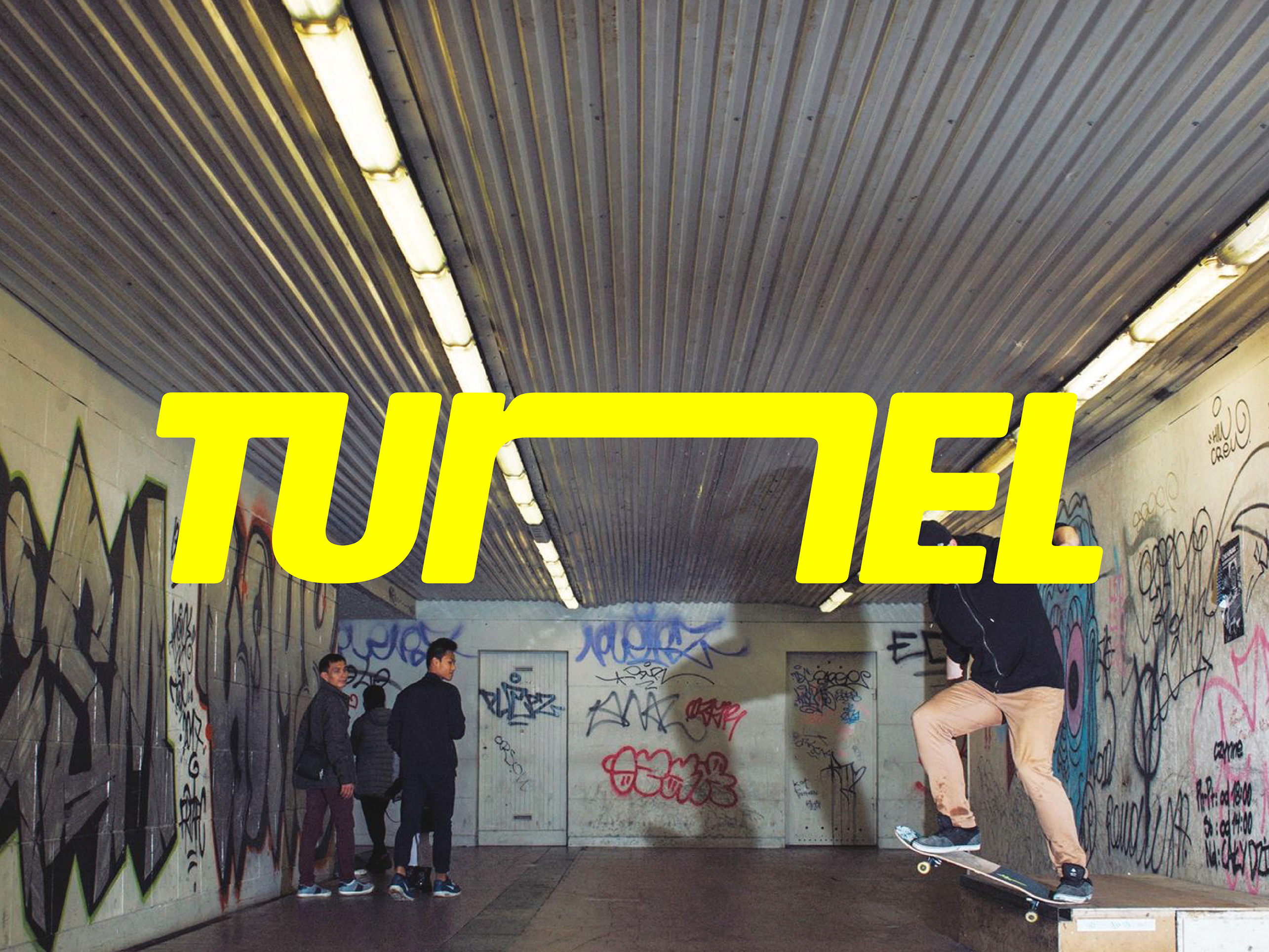
TUNEL Skate Spot
Visual identity
TUNEL is a skate spot located in an underground passage in Szczecin. This place was created from the bottom up in the spirit of DIY.
The sign refers to the history of the Polish skateboarding scene of the 90s and the surrounding aesthetics. Polish streetwear brands created at that time, such as Clinic MFE, Mass Dnm, Stoprocent, Storm Series and Bottle / BTL became the main source of inspiration. Stylistic treatments taken from the iconic signs for the Polish yard and used in the design of the TUNEL logo are curves and italics as well as contrasting colours of the yellow sign on a black background.
The assumption of the project was to convey the unique character of the Szczecin spot - the letter N symbolises the tunnel where the spot is located. In addition to the basic version of the sign, it is possible to create its variations. Used to vary the composition, they are obtained by extending the letter N.
Stone mosaics
Sculptures
In times of ecological crisis, we started increasingly question the legitimacy of all creative activities that contribute to the galloping production of things. Is creative fulfilment based only on what is already available possible? Such doubts became the starting point for creating recycled mosaics. The inspiration came from the ornamentation of the Polish People's Republic. The architecture of this period is famous for its decorative details, such as mosaics, reliefs or sgrafitto.
The involvement into a skate movement called Szaber Bowl, that built the local skate spot at the unfinished construction located in the city centre of Warsaw was a turning point into the perception of reusing materials. Ideas related to caring for the environment and prudent design while respecting the nature of the place perfectly matched the character of this completely bottom-up initiative, which is why the decision to use the waste from stone factories was naturally associated with the whole process.
The personal input in the do-it-yourself space was a creation of the mosaic along the main entrance. Following works were done are located in an office lobby and an entrance hall of a private estate.
Stones are provided by local stonemasons and he composition always depends on the available stones, their types and colors. Oftentimes during work there are inaccuracies in quantitative estimates, this is when an improvisation begins. Creating based on available materials means that the final product can differ significantly from the initial sketches.
Identity: 100 years of Polish architecture
Exhibition
The exhibition organised on the occasion of 100 years of Polish independence took place in five locations in parallel. Each of them presented a different chapter from the recent 100 years of Polish architecture history, focusing on the issues of art (Cracow), power (Warsaw), society (Lublin), transfer (Poznań) and change (Katowice).
Curators: Małgorzata Jędrzejczyk, Grzegorz Mika, Marcin Semeniuk, Karol Krupa, Alicja Gzowska, Jakub Świerzawski.
Exhibition design: CENTRALA with Aleksandra Zawistowska, Billy Morgan, Julia Lipińska, Kamil Urban
Graphic design: Tomasz Bersz and Aleksandra Zawistowska
Organised by National Institute of Architecture and Urban Planning (NIAiU).
My roles in the project were: graphic design of infographics, signage systems and communication materials, also the the execution of architectural models, based on the analysis of archival drawings
and historical photos:
- Polish pavilion for the 1925 World’s Fair in Paris
- restaurant pavilion in Kraków, 1936
- villa in Kraków, 1936
- interactive educational model of housing estate on Kubusia Puchatka Street in Warsaw
- interactive educational model of the Piastowskie housing estate in Lublin
- Warsaw’s Praga II housing estate and the zoo, 1958
- two typical three-room apartments in prefabricated mass housing: ‘M3’ from 1970s and ‘M3’ from 1980s
- Palm House in Gliwice by Andrzej Musialik, 1982-98
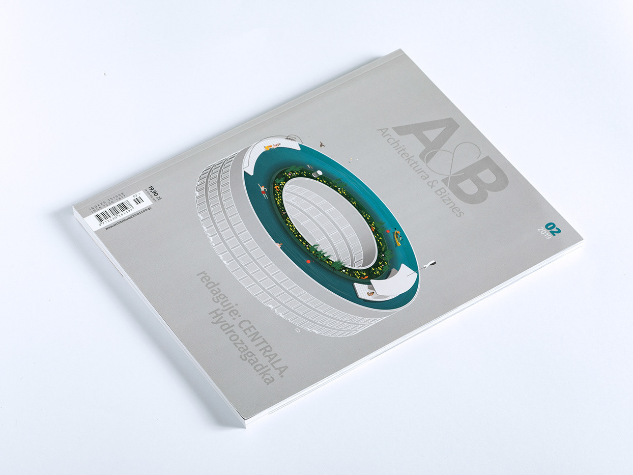
Sky Pond House
Illustration
The illustration created on a base of 3D parametic model for the cover of Architektura & Biznes 2019, no. 2 (in Polish only).
The first step of the process was a digital 3D model made in Rhinoceros with the use of Grasshopper plugin. Parametrisation was used to achieve desired proportions of the Okolnica building. The model structure was exported to Illustrator, where the illustration was finalised.
In 2019 the February issue of “Architektura & Biznes” monthly was co-edited by CENTRALA. The issue is called “Hydro-mystery”. The illustration based on the concept of Okolnica Sky Pond House by CENTRALA (Małgorzata Kuciewicz, Simone De Iacobis). The structure is a multi-family house, inspired by Okolnica Village. This rooftop of the building is a socialising area for the its inhabitants, where a circular swimming pool is placed. The water is being filtrated in a natural way by the water plants, a kayak storage and shaded platforms are located here as well. It is a space where people meet nature, coexisting side by side.

Powiat Łańcucki
Visual identity
Łańcut County is a region in Subcarpathian Voivodeship, located in south-eastern Poland. Home to many landmarks, such as the Łańcut Castle Museum, the region has potential to become a prominent tourist destination. The intention of the county’s new visual identity is to reactivate the region’s traditional visual expression and make it accessible through contemporary graphic language. The system of signs was inspired by motives from the region’s 19th century folk costumes with their unique embroidery palette of natural fabrics as linen and hemp.
In collaboration with Anna Nauwaldt.
we've
Application concept
Swapping is the new shopping
The concept of a mobile application as an answer to Non-architecture competition for a proposition of a new way of buying. This alternative idea for shops is based on shared economy principles.
Awarded with Honourable Mention by Non-architecture for “New ideas for buying”. In collaboration with Anna Nauwaldt.

MOYA Matcha Showroom
Interior design
Moya Matcha Showroom in located in Warsaw’s residential neighbourhood of Mokotów.
Moya Matcha is a brand producing fine Japanese organic matcha green tea. The showroom is a tiny space adjacent to the brand’s offices, located in a pre-war villa designed by a great Polish modernist, Bohdan Pniewski. The centrepiece of the interior is an original fireplace and a beautifully kept wood parquet. The showroom’s design is inspired by the meticulous, yet modest architecture of the villa and by the subtlety of Japanese fabrics and building techniques. The goal was to achieve a flexible storage and display space for matcha products and brewing accessories. The custom-made shelving system adopts a traditional Japanese carpentry technique of nail-free joints, allowing for future adjustments. Both the shelves, and the central counter are designed in light birch plywood. To round off the interior, we have used delicate fabric and paper fittings, such as lamps and a hanging space divider.
In collaboration with Anna Nauwaldt.